Mindbox


Mindbox
BRIEF: To refresh a website we created a few years ago.
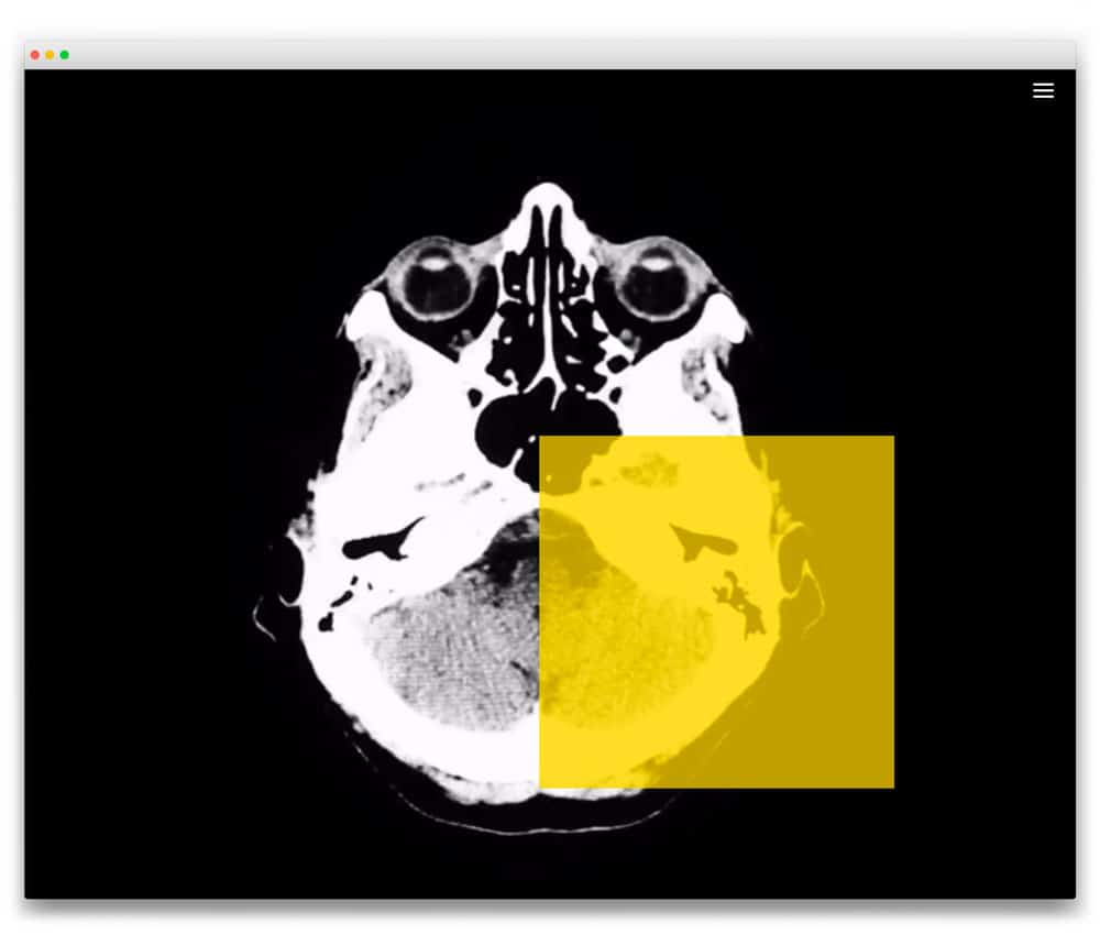
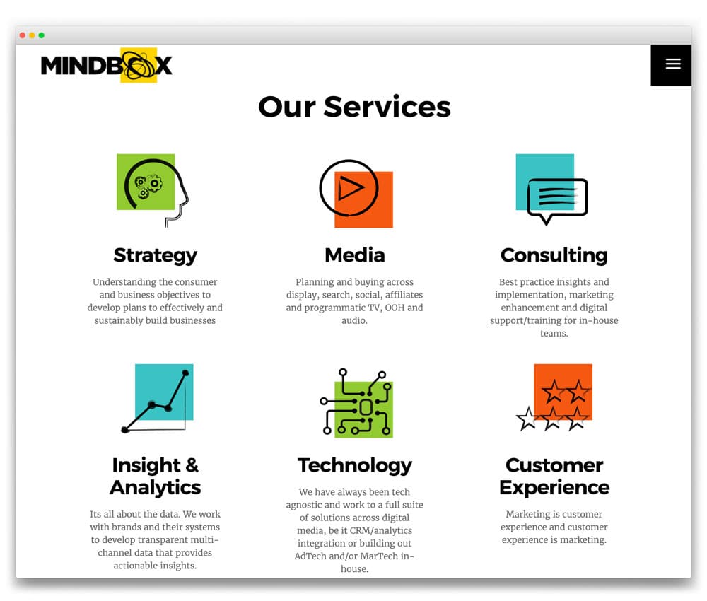
SOLUTION: The original site was created by us as a parallax website with all content on the home page. This time we simplified the home page and provided an easy path to get to additional information about the team and services. We kept elements from the previous website like the Work section and the opening video, but we developed it further by introducing the yellow square, a feature of the Mindbox brand. We also introduced more brand colours and created bespoke service icons to match the brand design.
OUTCOME: A clean bold website, that is very simple to navigate.
